
Car brand Kia has unveiled its new logo and brand slogan, the latest in a string of car companies revamping their image for a rapidly changing contemporary market.
![]()
Displaying a dramatically different typographic approach, shape and new colour scheme, the new logo is far from a brand tweak, but reveals a bravely large step away from its old image. It launched the new logo in an epic firework and light show in Seoul, South Korea, where it is headquartered, that gave many of the global New Year’s celebrations a run for their money, the mark created from drone lights in the sky that shot out jets of sparks. This also set a new world record for the “most unmanned aerial vehicles launching fireworks simultaneously”.
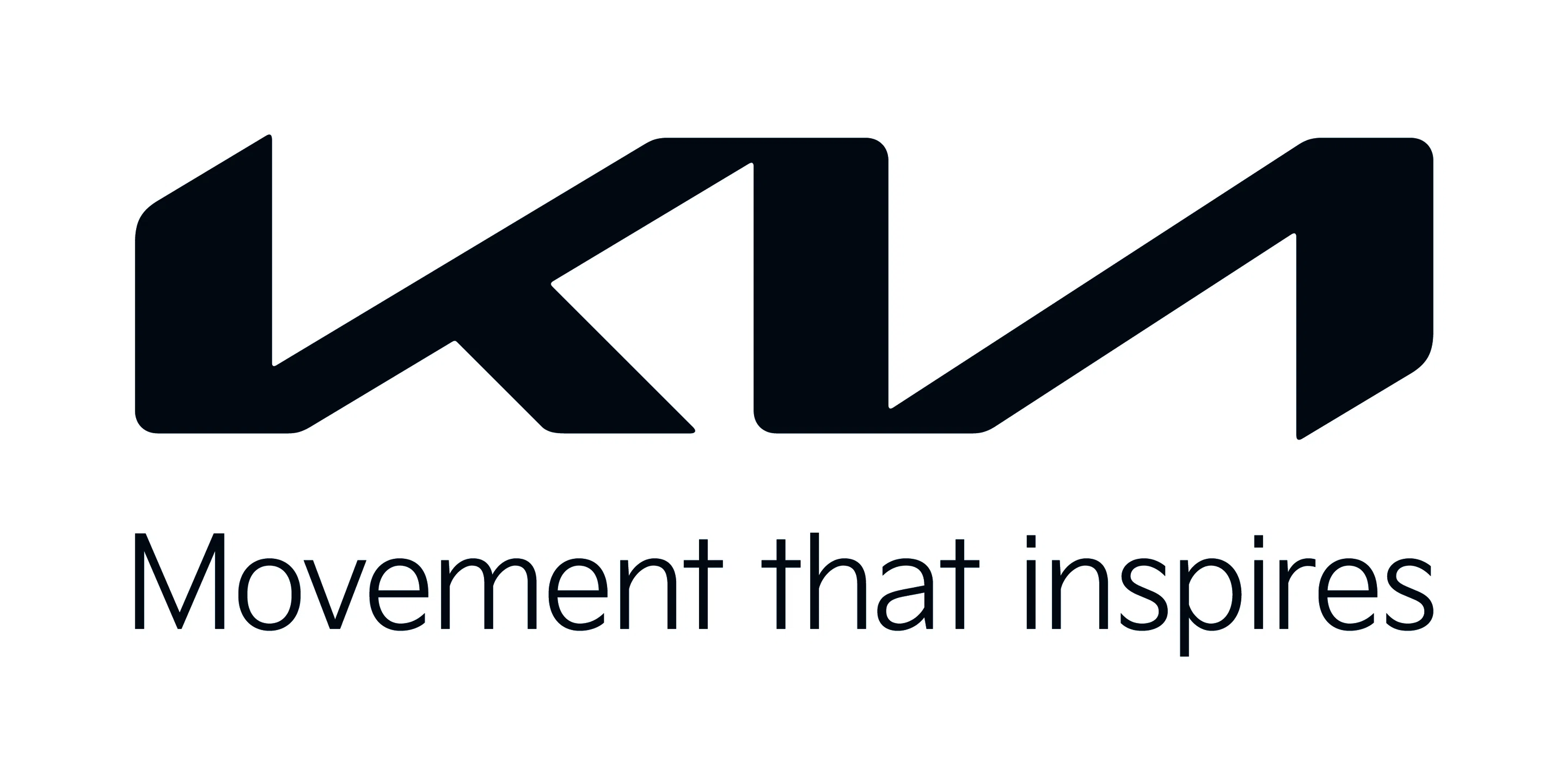
Kia’s old logo was its word mark in all caps but separate letterforms, its signifying detail being the missing horizontal bar on the ‘A’, which has stayed for the rebrand.
The three characters also had a distinctive serif flick on the top left, a subtle hint at conveying movement. This detail has been shed in the redesign by its in-house team, and the type is now joined up, designed to resemble a handwritten signature, a “rhythmical, unbroken line,” the brand says in a statement.

The word mark places heavy visual emphasis on the acutely angled ‘K’ and ‘A’ forward slants, and has a new similarly angled chamfer to the top left of the ‘K’ and bottom right of the ‘A’ that mirror each other. The brand says its symmetry “demonstrates confidence” while the “rising gestures” of the logo (referring to the sharp slants) “embody Kia’s rising ambitions for the brand”.
Overall this carries forward the feeling of movement from the old logo, but in a more sophisticated way. While the type is less clearly legible than the old logo, the mark is nonetheless a bolder and more coherent, modern symbol.
The branding also replaces its red, white and black branding with black on white, though it may reveal more colourways in a forthcoming full brand strategy presentation on 15 January. This, and the new typography, aligns the brand more strongly with its parent company Hyundai.
“Kia’s new logo represents the company’s commitment to becoming an icon for change and innovation”, says Ho Sung Song, Kia’s president and CEO. “The automotive industry is experiencing a period of rapid transformation, and Kia is proactively shaping and adapting to these changes. Our new logo represents our desire to inspire customers as their mobility needs evolve, and for our employees to rise to the challenges we face in a fast-changing industry.”
Kia also announced its new brand slogan, “Movement that inspires” – replacing its former slogan “Power to surprise” – adding that its “bold transformation and all-new brand purpose… represents [its] ambitions to establish a leadership position in the future mobility industry by revamping nearly all facets of its business”.
What do you think of the new logo rebrand?
If you’re also looking for a logo refresh, why not check out Rtist? We have one of the biggest creative talent communities in Malaysia that matches you with creative freelancers. Check us out!