In an ever-evolving business landscape, strategic rebranding can be the key to unlocking success and staying ahead of the competition. One remarkable example of this is Xiaomi's 2021, $300,000 (RM1.5 million) rebranding campaign, which has captured the attention of people worldwide.
This article delves into the transformative journey undertaken by Xiaomi, exploring the motivations behind the rebranding, the strategies employed, and the lessons it holds for those seeking to enhance their own brand presence. Join us as we unravel the story of Xiaomi's rebranding success and uncover valuable insights for industry professionals.
Isn’t the logo just a small change from the previous?
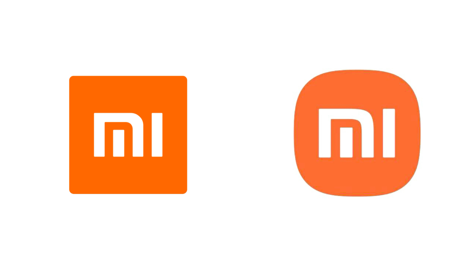
While it seems like the logo is just the same, and that the only difference was, the sharp edges have become rounded edges. It doesn’t make sense to pay $300,000 (RM1.5 Million) for such a small project right? But Japanese designer, Kenya Hara thinks otherwise, and he even had a 20 minute video explaining the whole inspiration for the design.
To most untrained eyes, the logo just looks like it went from having sharp edges, to having rounded edges. But to some extent, there was mathematics involved as Hara and his team used the superellipse equation to create the logo. Kenya Hara and his team were trying to find a good balance between the old square design and the rounded shape they opted for in the current design.
Click here to check out Kenya Hara's work on his website
Understanding the Motivation Behind the Rebranding

Xiaomi's decision to invest a substantial sum of $300,000 (RM1.5 million) in rebranding stemmed from a strategic drive to elevate its brand positioning and expand its market presence.
As a leading technology company, Xiaomi recognized the importance of staying relevant in an increasingly competitive market. The rebranding aimed to communicate Xiaomi's evolution from a budget smartphone manufacturer to a provider of innovative and high-quality tech products across various categories.
Small redesign, but big branding returns.
Xiaomi got you right there, as their small logo redesign was just to create a big talking point among people. By making a huge deal about their subtle redesign, Xiaomi attracted so much attention from the public and created so much discussion. This wouldn’t have been possible with a significant logo redesign.
While they always say, any publicity is good publicity, this isn’t entirely true. While Xiaomi did generate a huge deal about the subtle redesign, at the start, it was seen as a huge mockery. People laughed at Xiaomi for a while, created memes and made the brand a mockery, but as time went on, the added attention paid off with Xiaomi being more distinguished, with higher attention on Xiaomi’s products as the brand is more distinguishable.
Brands these days favor graphic simplicity and directness.

Recently, the trend of rebranding is subtly changing their logos. To preserve the brand’s look and reduce the visual complexity, all while making sure that the logo remains identifiable. In short, logos need to stand out but customers shouldn’t overthink it.
The bigger your brand is in the market, less is more. Your audience still needs to know who you are, let them make their own association with you, than to make them think what you want them to think. While the aim is to have minimal change, the logo rebrand still needs a story behind it and unveiling it still needs to be a spectacle!
In short, Xiaomi didn’t pay for a small logo redesign, but a huge brand awareness campaign.
While the logo redesign was small, their brand awareness campaign was huge! Xiaomi did the whole rebranding perfectly by minimally changing their logo and unveiling it after 3 years. People wondered what took Xiaomi 3 years to just change a small fraction of their logo?
It was the amount of work done on the branding side that got people speaking about Xiaomi, 3 years of hard work included, recreating their logo, getting Kenya Hara, the logo designer, to create a big story about the logo change and delaying the launching time. Sure, it was a mockery at first, but it was crucial to Xiaomi’s presence in the market!
With Rtist, you can hire creative talents for your brand redesigns.
Xiaomi’s rebranding campaign was a huge success and they remain a big technological player in the market. All thanks to intelligent branding strategy. A branding direction is usually led by a brand manager/brand owner, but a designer is also key to creating an unforgettable rebranding experience for a business.
Rtist Creative Platform has over 11,000 creative portfolios for you to hire in your company’s rebranding, plus, you can check out their portfolios before determining if they’re a right fit for your rebranding campaign.
Come, sign up for FREE as a client and check out Rtist designer’s portfolios here!