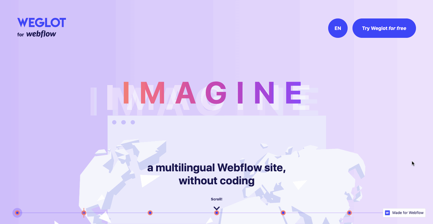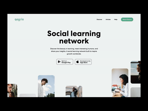
It is important to note that each of these trends below accommodate separate industries and user personas. Implementing these styles isn’t merely an aesthetic decision, but also helps to decide which specific trend suits your business goals, and how it will positively impact your audiences and their actions on your website.
Without further ado, here are the top web design trends that will be huge in 2021.
1. Dark mode
Dark design, or dark mode has been rapidly gaining a lot of attention, and has become a growing web trend. Dark mode is essentially a low-light user interface (UI) that uses dark colors and design elements. Before dark mode came about, it was thought designers could only create the illusion of open space with the color white.
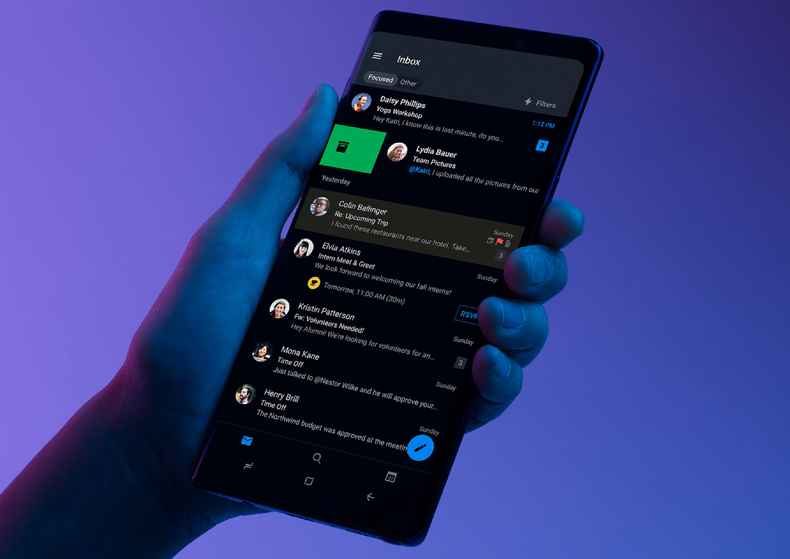
Image from: Medium
With dark mode, designers have been using black to achieve the same effect, with many websites and apps adopting dark design. Not only does this allow for different elements to become more visible and move to the forefront, it also allows for brands to establish a bright call to action color that is easily identified by the user.
White, or particularly brighter backgrounds are able to convey a minimalist aesthetic, but in the long run, it can become very uncomfortable for users’ eyes. In addition to being easy on the eyes, the dark mode offers a great contrast for texts. Further, dark mode can also give your website an overall sleeker look and appearance.
Parallax scrolling has been around for a while but it's one of those web design trends that just keeps on going. Parallax scrolling is when the website layout sees the background of the web page moving at a slower rate to the foreground, creating a 3D effect as you scroll.
The idea behind parallax scrolling is that when users scroll down a page or mobile app, they browse through content. Through scroll transformations, this interaction can be visually guided to make them aware of certain content. This helps the user become more “involved” in the things that are happening on the screen, increasing their engagement with the page.
A few ways that you can achieve this for a great parallax design for your website is by amplifying the visual feedback received by your users, whether it is changing the color scheme or utilizing complex transformations or animations to give an effect of scrolling through different web pages.
As a design element for your website, it can provide a nice, subtle element of depth that results in a distinctive and memorable website if used sparingly.
3. Neumorphism
Neumorphism, or the use of “soft UI” design is one of the newer and hottest digital design trends in recent years. The name comes from combining New + Skeuomorphism, which is a style that focuses on the colors in a design to create layers and depth.
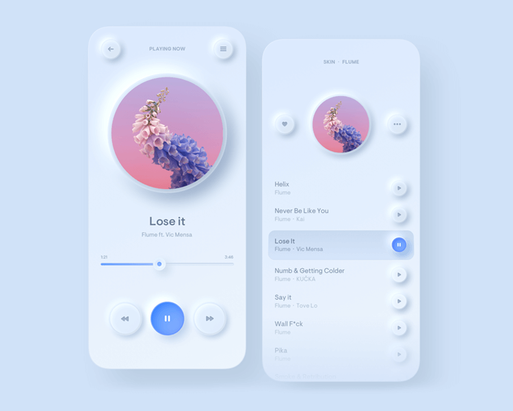
Image from: JustInMind
This design style, which only came into popularity in late 2019, early 2020, relies heavily on using shadows to achieve a floating-like effect on the elements in your website or mobile application. All that allows achieving a soft, extruded plastic look, and almost 3D styling.
The design focuses on changing the ‘super flat and minimal’ vector to something midway to realism. The end result often resembles an embossed look that pops especially when applied to buttons or type.
4. Soothing color palettes
After the year we’ve had in 2020, it’s not surprising that one of the most anticipated design trends in 2021 is the soothing, calm color palettes in both web and interface design. Soothing and calm design has been around for a while but it was always on the backburner to the more favored strong, bold colors.
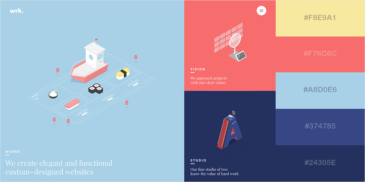
Image from: Visme
Stronger and bolder color gradient schemes have been effective in capturing attention, but the screen’s sharpness and clarity can actually cause such colors to be overbearing and even stressful for the human eye to look at for long periods of time. Light colors have the opposite effect on-screen, and may even be preferred over dark, bolder colors. The screen’s sharpness and clarity can actually cause such colors to be overbearing and even stressful for the human eye to look at.
On the contrary, the soothing effect of light colors often encourages users to stay on the page for longer, enjoying the color palette’s tranquility and warmth.In fact, with an added value of light colors in web design, it will also help to be more conducive to user engagement.
Scrolling transition effects are becoming more and more popular as a means of increasing interaction and user interest. The main purpose of scrolling transitions is to create a natural demonstration that something has changed. This approach works great for long one-page websites that want to provide a more dynamic and spirited appearance and visual representation.
Scroll activated animations bring their own touches and appeal to the website by providing simple users with a more smooth, careful and calm exploration. Choosing the right transition between pages can enhance visual impact in digital storytelling. They are a powerful way to enhance and delight user experiences, as well as allow your user to be more interested and engaged with what is shown on the screen.
Conclusion
Each year web design and animation are gaining more influence, and more and more designers and developers create and experiment with new trends and practices. This gives rise to new opportunities to embrace these design trends and attract visitors by standing out among the increasingly competitive landscape.
Image from: 99Designs
In order to embrace the trends that work best for you, you can consider the ways to integrate these individual trends with your brand’s relevant use-case, according to your design language and audience interests.
Have a knack for designing websites yourself or looking for a website designer? Why not check out Rtist? We have one of the biggest creative talent communities in Malaysia that matches you with your clients.
